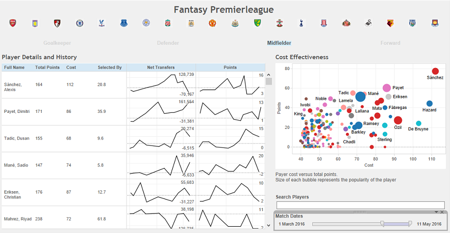
Fantasy Football - Tableau
The dashboard described in this post is available on tableau public.
Motivation
The aim here is to create a dashboard to help decide which players to transfer in to your fantasy football team. For those who are unfamiliar, you have a set budget with which to populate your team. Each week your players receive points based on how well they perform. So, the two most important questions you need to first ask are can I afford this player and what sort of points return can I expect?
Your team has to conform to a ‘realistic’ formation, so having exclusively strikers is not allowed. Typically you’ll be looking for a player to fill a particular position so there needs to be an easy way to just compare players of the same position.
Finally, at the tail of the season there’s no point buying the highest scoring player if he has performed poorly for the past few weeks. You want to get players who are on form so being able to see their recent performance is a definite plus.
So, with all these requirements in place, lets get started!
The Data
Sadly, with the recent update this season to the fantasy website their api accessing player data is no longer available. When this dashboard was made it was possible to access the player resources via this api. This gave the full player data in json format, containing their bio along with stats for their performance each gameweek. A simple python script allowed me to extract the fields I wanted for every player and save into a csv file, ready for loading into Tableau.
Points / Cost Ratio
The first port of call is giving a quick way to compare players points return relative to their cost. A scatterplot of cost versus total points gives a nice way to quickly make this comparison. Additional dimensions can encode for the popularity (Using the bubble size) and the team (Matching the colour to the kit).
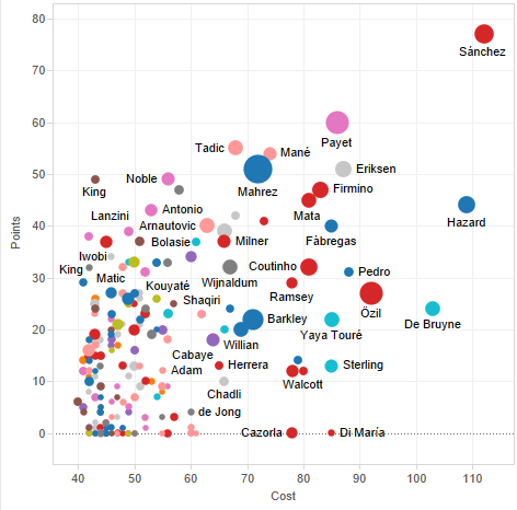
From this the cost-effectiveness between two players can easily be compared. For example, Tadic and Mane have almost the same total points but Tadic is cheaper and therefore the better option.
Player Form and Popularity
As useful as the scatterplot is, it only gives a single snapshot in time. There’s no way to tell from it which players are in form right now, so a way to view the trend in performance is also needed. Sparklines are ideal here, showing the recent trend in the points a player has received. The trend in popularity is also a good indicator of performance - if everyone is selling a player it might be worth avoiding him. These are easy in Tableau, with the date as the x-axis and points / net transfers as the y-axis. To add even more detail they can be combined with some summary values about the player.
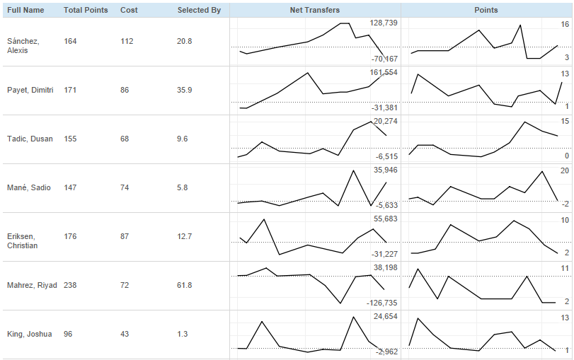
So, from this, despite being in the top 5, Erikson is currently on a downward trend.
Bells and Whistles
These two plots combined give a pretty comprehensive dashboard showing both a current comparison along with historical trend. To really get the best use out of this we want to add some extra functionality - filtering would be a good place to start. Having buttons to select position or team as a filter would be nice but isn’t natively available in Tableau. Thankfully some hacking can get around this.
The key thing is that scatterplots can use custom shapes for the plot. Combining this with the fact that graphs can be linked (So a selection in one graph filters the content in another) allows nice filter buttons to be added.
Take the team data for example. Create a scatterplot with team on the x-axis and a dummy variable with a single value of 1 per team on the y-axis. This gives us a series of dots all in a line. Now, replace those dots with custom images - the team crests. Adding team to the shape dimension allows a custom shape to be added to each team. Then just select the relevent crest for each team. The final step is to hide all axes and change the background colour, giving this

The exact same thing can be done for position except in this case rather than using custom shapes, the text was used.
End result
Putting all the above into a single dashboard and linking together gives this nice result